

In A Nutshell
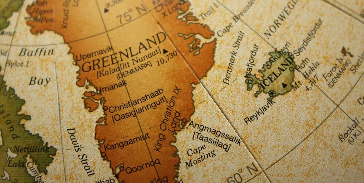
Greenland is massive. Just look on any old public school map or visit Google maps, and you’ll be able to see how big it is. An enormous expanse of white, it comfortably dwarfs the whole of Europe and is nearly the same size as Canada. Some country, huh?
Of course, Greenland really isn’t that big. At around 2 million square kilometers (770,000 mi2), it’s less than a quarter of the size of Canada. The map we most commonly see is a Mercator projection, a Renaissance-era way of making a map that can easily be used by navigators. But even if we know Greenland is smaller than Canada, it can still shock us to see how small it really is. A new online map called the True Size Map allows users to drag and drop Greenland (or any other country) onto any landmass on Earth. The results will change the way you view maps forever.


The Whole Bushel
If you attended public school before 1991, you can probably remember the moment you first saw a map and were totally wowed. In those days, Mercator projections were still used to show the size of countries, and the result was likely seared into your infant brain. On a Mercator map, Russia is a vast, looming beast that looks like it could swallow the world. The US is dwarfed by Canada, and the Antarctic is a vast wilderness of icy despair. Most impressive of all is Greenland. A huge lump of ice, it appears as roughly the size of Africa.
As we get older, most of us learn that a Mercator map isn’t particularly accurate for judging size. It exaggerates the size of countries near the poles and compresses those lying on the equator. In reality, Greenland is only slightly bigger than Mexico at 2 million square kilometers. Antarctica is 14 million square kilometers (5.5 million mi2)—still huge, but not even as big as Russia. But there’s a difference between knowing these facts and actually seeing them demonstrated. A new project called the True Size Map aims to prove that Greenland is even smaller than you already think it is.
The website uses a standard Mercator projection, with one key difference. You can drag and drop any country you like near any other, and it will adjust the size accordingly. So you can take Greenland and place it over the US, for example, and Greenland will shrink to fit as it would in reality. Playing about with it is guaranteed to blow your understanding of world geography wide open.
By the time you drag it to the equator, Greenland isn’t just smaller than you think. It’s tiny. While a Mercator projection has it looking the same size as Africa, actually place it on Africa and you’ll see it’s barely a blip. It covers the same amount of space as the Central African Republic, DR Congo, and the tip of Angola. Not a small space by any means, but much tinier than most of us would expect.
In fact, move just about any country onto Africa and you’ll see just how large the continent really is. China, India, and the continental United States could all fit on there with a bit of room to spare. Meanwhile, DR Congo alone—a country that features as a tiny dot on Mercator maps—could cover all of the Western United States and most of the Midwest, too.
Fun as it is to play around with the map, it does have a serious point. From an early age, many of our perceptions of the world are formed by what we see on maps. To many of us, Africa is an insignificant place rather than the towering landmass it really is. Meanwhile, Europe appears far bigger and more important than most other continents, despite its laughably small size. This can have consequences for how we view the world—consequences the True Size Map is laudably aiming to correct.
Show Me The Proof
The True Size Of…
Vox: This interactive website shows how wrong Mercator projections can be
Wired: Get To Know A Projection: Mercator
Greenland looking enormous on Google Maps


